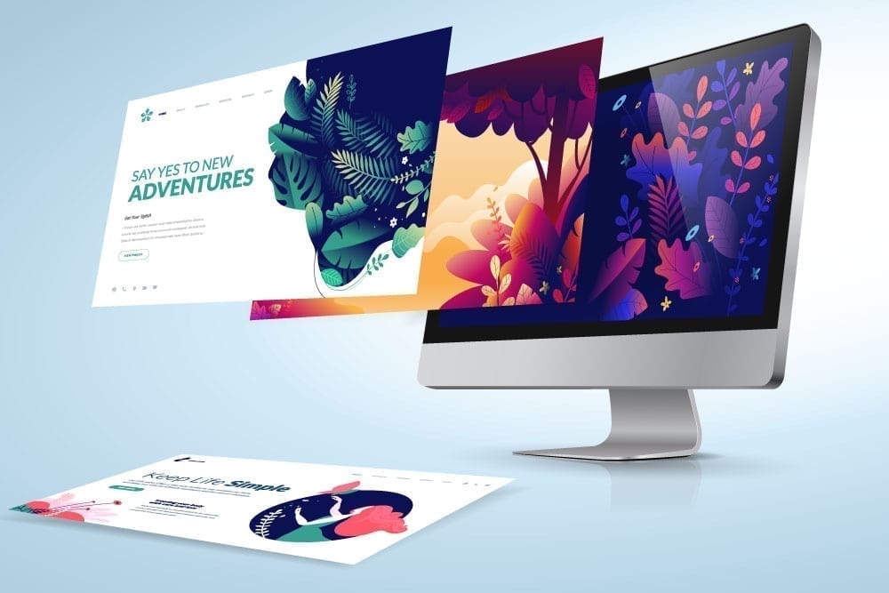
Animation Training in Salt Lake is a gateway to mastering the art of animation and design. Whether you're passionate about creating dynamic graphics or bringing characters to life, specialized training can elevate your skills and set you apart in a crowded industry. Enrolling in a top Animation Institute in Salt Lake, like Arena Animation Salt Lake, provides you with the expertise and practical experience needed to succeed. With its comprehensive curriculum and industry-focused approach, you’ll be well-equipped to tackle a variety of creative challenges.
The Crucial Role of Color in Design
Color is not just an aesthetic choice; it’s a fundamental aspect of design that influences how a message is perceived. From ID cards to business cards, envelopes to letterheads, and posters to banners, the use of color can significantly enhance the effectiveness and attractiveness of a design. The choice of colors can convey different emotions and messages, making it a powerful tool in both corporate and non-corporate settings.
In the restaurant and food industry, warm colors such as red, yellow, and brown are commonly used to evoke a sense of warmth and appetite. These vibrant colors are designed to grab attention and create a welcoming environment. On the other hand, the medical field often utilizes cool and fresh colors like green, blue, and orange to convey cleanliness and professionalism. While red might occasionally appear in medical logos, the primary color palette focuses on calm and reassuring tones.
Selecting Colors for Various Occasions
Choosing the right colors for different occasions can greatly impact the overall design. For joyful and celebratory events, bright colors such as red, yellow, pink, and violet are often preferred. These colors can evoke happiness and excitement, making them suitable for invitations and greeting cards. Conversely, for somber occasions or formal purposes, more subdued colors like white, grey, and light brown are typically used. These colors convey a sense of respect and formality, fitting for official documents and condolences.
When it comes to letterheads, the standard practice is to use a white base color. This neutral background allows for a wide range of colors to be used for headers and footers, providing flexibility in design. ID cards generally feature a white background with contrasting colors used to highlight important information. Business cards offer even greater freedom, allowing for a variety of colors to create a striking and memorable design that stands out.
The Impact of Effective Logo Design
Logo design is an essential element of branding that relies heavily on color choice. A well-designed logo not only reflects the company’s identity but also helps in building a lasting impression. The right colors can convey the brand’s values and connect with the target audience on an emotional level. To excel in logo design and other creative projects, consider pursuing Animation Training Salt Lake or joining Arena Animation Salt Lake. These programs provide valuable insights and hands-on experience to help you create logos that are both visually appealing and effective.
By understanding the role of color and how to use it effectively, you can enhance your design projects and make a meaningful impact. Investing in quality animation training will not only refine your skills but also open up new opportunities in the world of design and animation.
